UI
A collection of opinionated React components built on Tailwind.
What is a 窓?
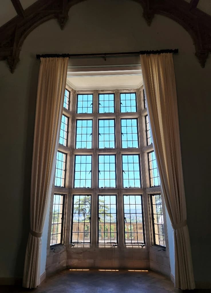
窓 (mado), means window in Japanese. We want our window to be large, clear, and as clean as possible.
Component library
There are many components that are intended to make your life as a developer easier. Stop trustingAI to design your components, and stop waiting for designers to finish their work—and, the worst option, stop thinking you're good at UI/UX design… Alright, you might actually be good at UI/UX design, so each component is easy to adjust to your liking, without losing some particularly useful defaults.
Now, let's say you're not great at UI/UX design, but want to get better. Good! Please support the folks at Tailwind by purchasing their book: Refactoring UI. Without Tailwind, 窓 UI would not be possible.
Getting Started
Installation
npm install @andrilla/mado-ui

pnpm add @andrilla/mado-ui

yarn add @andrilla/mado-ui

bun add @andrilla/mado-ui

deno add npm:@andrilla/mado-ui
Be sure to install the required peer dependencies:
npm install react tailwindcss use-context-selector scheduler

pnpm add react tailwindcss use-context-selector scheduler

yarn add react tailwindcss use-context-selector scheduler

bun add react tailwindcss use-context-selector scheduler

deno add npm:react npm:tailwindcss npm:use-context-selector npm:scheduler
The first thing you need to do is add the CSS to your project (likely in a globals.css file).
@import "@andrilla/mado-ui/css";General Usage
Other than components there are four other exported directories.
- Provides all of the necessary CSS variables and classes for styling. This must be paired with Tailwind CSS in your globals.css.
- Provides graphical assets that you may find useful. The primary purpose is social media logos, including Facebook, Instagram, X, YouTube, LinkedIn, TikTok, and Google.
- Provides useful React hooks for common tasks, including color scheme detection, form status context tracking, mobile device detection, and pointer movement.
- Provides helpful utility functions for common tasks, including class management (CSS classes on elements), customizing tailwind merge, date object reading and formatting, React helpers (get static text from children without requiring the client), regular expression checks, and various string manipulation utilities.
- /css
- /graphics
- /hooks
- /utils
Detailed Usage
Be sure to scroll back up to see detailed usage of components.
CSS
Tailwind Merge
Tailwind Merge is built in and extended in this project, to support all of the additional utilities and changes we made.
There is no need to install tailwind-merge. You can simply import it from this project.
import { twMerge } from '@andrilla/mado-ui/utils'However, twJoin() is not supplied. Instead of installing tailwind-merge, we recommend joining an array of strings.
1 2 3 4 5 6 7 8 9 10export function MyComponent() { return ( <div className={[ 'bg-blue-500', 'text-red-500', ].join(' ')} /> ) }
If you need to extend tailwind-merge, you can import extendMadoTailwindMerge() and use it just as with extendTailwindMerge().
import { extendMadoTailwindMerge } from '@andrilla/mado-ui/utils'Tailwind CSS Changes
To help create better design with less work, there are some changes to the Tailwind base that you should be aware of. There are also some additions to the theme and some helpful utility classes that may prove useful.
Directional intent
It's important to understand the intent behind many of these changes. We believe modern CSS to moving toward almost exclusively logical properties. Even Tailwind changed px-* and py-* to use logical properties. In light of this, many of these changes take current utility classes and pair them with logical properties, or add logical property features.
We also believe design systems should be interconnected, meaning properties rely on each other for their values. This means changing one property automatically aligns related properties, without you needing to update them all individually. This helps massively with maintainability as well.
Lastly, although Tailwind includes almost any property you might need, we believe creating unique design systems each time, requires more options—some of which utilize features that not every browser supports.
Base @layer base
All elements receive relative position, since intentionally using
position: absoluteto position an element outside of its parent is a rarity, and can be easily changed with the static class. This also helps avoid confusion when some elements default to relative instead of static.All elements receive no minimum width, because browsers include min-width by default, on elements like
<input>which makes them confusing to work with* { position: relative; min-width: 0; }All headings, even without using the
Headingcomponent, receive balanced text wrapping.h1, h2, h3, h4, h5, h6 { text-wrap: balance; }Body text receives a lighter opacity to provide distinction from headings, and pretty text wrapping.
p {
	color: color-mix(
		in oklab,
		currentcolor 80%,
		transparent
	);
	text-wrap: pretty;
}
Buttons use the pointer cursor, except when disabled.
button:not(:disabled):not([aria-disabled='true']) {
	cursor: pointer;
}
Fill and stroke colors on SVG elements match the current color, making it easier to pair with text.
stroke-width: 0is only here because settings a stroke color makes the stroke width 1. It will not override stroke widths set on SVGs.svg { fill: currentcolor; stroke: currentcolor; stroke-width: 0; }Images and videos use logical sizing.
img,
video {
	max-width: none;
	height: auto;
	max-inline-size: 100%;
	block-size: auto;
}
Theme @theme
There's a lot in the theme, that relates to utilities. See the utilities section for those theme variables.
We built components with color around the
--theme-colorcustom property, making it really easy to change the color, per use, on the fly. Most of the time, however, you just need the theme color to match your brand. To do this, just change the--base-theme-colorcustom property.Along with the base theme color, there are two connected custom properties:
--base-theme-color--foregroundand--base-theme-color--accent. These are used to set the foreground and accent colors of the theme, respectively. Most of the time, you should only change the base theme color, but if you need more control, you can change each separately.--base-theme-color: var(--color-blue-500); --base-theme-color--foreground: color-mix( in oklab, var(--base-theme-color) 5%, var(--color-white) ); --base-theme-color--accent: color-mix( in oklab, var(--base-theme-color) 90%, var(--color-white) );CopiedWe often found that Tailwind's largest container size,
--container-7xl, wasn't quite large enough, so we added--container-8xlto the theme. This is the same size as the2xl:media query.--container-8xl: 96rem; /* 1536px */Transition timing functions are good by default, but we wanted them to be much more extensive, to help fit any scenario. All of the timing functions are provided by Anime JS. Here is a list of all of the available timing functions (prepend with
ease-as you would expect).- in
- in-back
- in-bounce
- in-circ
- in-elastic
- in-expo
- in-out
- in-out-back
- in-out-bounce
- in-out-circ
- in-out-elastic
- in-out-expo
- in-out-sine
- in-sine
- irregular
- irregular-light
- irregular-heavy
- out
- out-back
- out-bounce
- out-circ
- out-elastic
- out-expo
- out-in
- out-in-back
- out-in-bounce
- out-in-circ
- out-in-elastic
- out-in-expo
- out-in-sine
- out-sine
- power-in
- power-in-out
- power-out
- power-out-in
- spring
- spring-bouncy
- spring-snappy
- spring-strong
- steps-start
- steps-start
And on the note of timing functions, we changed the default timing function to out-expo. This is because it provides an instant-response feeling that still feels smooth. Despite this default, please consider which timing function feels best for your brand, and use it as the default.
--default-transition-timing-function: var(--ease-out-expo);CopiedUnless your brand calls for it, avoiding absolute white and black is ideal, so we added these helpful custom properties, for your convenience. They are used in a few components, when a background or text color is needed, without inheriting from an ancestor.
--global-bg: light-dark(var(--color-neutral-50), var(--color-neutral-900)); --global-text: color-mix( in oklab, var(--global-bg) 10%, contrast-color(var(--global-bg)) );CopiedChanging them to fit your brand is ideal. The best way to do this is tinting the neutral color palette with your brand's primary color. If you prefer, you can change them directly. Changing only the
--global-bgwill automatically change the--global-textwith an appropriately contrasting color.Something that we chose to not include by default is use of these properties on the body, but we highly recommend you add this to your
globals.css.@layer base { body { color: var(--global-text); background-color: var(--global-bg); } }CopiedThe
text-*utility for changing font-size has been extended to include relative sizing. This is useful when you want a span to be smaller or larger without having to set it manually, especially if the parent changes font-size across multiple breakpoints.--text-smaller: smaller; --text-larger: larger;
Utilities
This section is split into two categories: Extensions and Additions. Extensions are additional value or changes to Tailwind's default utilities. Additions are new utilities that are not part of Tailwind.
Extensions
Most of these extensions are adding values that Tailwind is very likely to support natively in the future, while others are there to make your life easier.
Container Changes
Tailwind deliberately removed
margin-inline: autoandpadding-inline: 2remin v4, in order to make the container more generic. Although it makes sense for Tailwind to ship like this, we found the container class to be unhelpful, since it only changes themax-widthat each breakpoints.We believe it is more effective to have a consistent design choice for spacing, so we opted for changing the padding (block and inline separately) at each breakpoint. We also change the
max-widthtononeand opt formax-inline-size: var(--container-8xl); /* 96rem = 1536px */max-inline-size: var(--container-8xl); /* 96rem = 1536px */Generally, when a sibling container is present, the padding should be merged, to avoid double spacing. To solve this, we use
&:has(+ .container)to remove thepadding-block-endfrom the element. If you have back-to-back containers with different background colors, add the.keep-block-endclass to the container first to keep the padding.Gap Utilities
Since inheritance in CSS requires the parent element to have a defined value for the property, we added some helpful custom properties to make it easier to maintain consistent spacing.
.gap-4 {
	--tw-gap: calc(var(--spacing) * 4) /* 1rem */;
	--tw-gap-x: calc(var(--spacing) * 4) /* 1rem */;
	--tw-gap-y: calc(var(--spacing) * 4) /* 1rem */;
	gap: calc(var(--spacing) * 4) /* 1rem */;
}

.gap-x-4 {
	--tw-gap-x: calc(var(--spacing) * 4) /* 1rem */;
	column-gap: calc(var(--spacing) * 4) /* 1rem */;
}

.gap-y-4 {
	--tw-gap-y: calc(var(--spacing) * 4) /* 1rem */;
	row-gap: calc(var(--spacing) * 4) /* 1rem */;
}
Grid Template Utilities
Tailwind uses a standard
repeat(* 1fr)value forgrid-cols-*andgrid-rows-*utilities. This means that you can't properly transition between them without arbitrary values.Until
interpolate-size: allow-keywordsis a baseline feature for a few years, we use grid template properties to smoothly transition height or width between0andautovalues. To assist with this, we added support for0frand1frvalues, without need for arbitrary declarations..grid-rows-0fr { grid-template-rows: 0fr; } .grid-cols-1fr { grid-template-columns: 1fr; }Likewise, with its commonality, we found it useful to add transition utilities for each.
.transition-cols {
	transition-property: grid-template-columns;
}

.transition-rows {
	transition-property: grid-template-rows;
}
Grid Lanes
Although
display: grid-lanesis experimental, we do expect it to become a baseline feature in the future. Since it's also almost identical todisplay: gridin it's functionality, we found it easy to provide progressive enhancement for it..grid-lanes { display: grid; @supports (display: grid-lanes) { display: grid-lanes; } }Size Utilities
This extension is to assist in our prioritization of logical properties. First, we added support for logical viewport units:
vb,vi,dvb,dvi,lvb,lvi,svb, andsvi. This applies toblock-*,inline-*andsize-*utilities.In addition to these, we extended the
size-*utility to use logical properties, instead ofwidthandheight.Realistically, none of this should affect existing layouts.
Additions
We've added support for a few CSS properties that have been around for a while, and some that are experimental for progressive enhancement.
Animation Utilities
A whole fleet of animation utilities have been added so you can easily adjust animation properties on the fly, without having to change the animation declaration itself.
animation-delay-*This accepts an integer value in milliseconds..animation-delay-500 { --tw-animation-delay: calc(500 * 1ms) /* 500ms */; animation-delay: var(--tw-animation-delay); }animation-duration-*This accepts an integer value in milliseconds. It sets the value to--tw-animation-duration. You may also provide a modifier to adjust the delay..animation-duration-500 { --tw-animation-duration: calc(500 * 1ms) /* 500ms */; animation-duration: var(--tw-animation-duration); }.animation-duration-500\/250 { --tw-animation-duration: calc(500 * 1ms) /* 500ms */; --tw-animation-delay: calc(250 * 1ms) /* 250ms */; animation-duration: var(--tw-animation-duration); animation-delay: var(--tw-animation-delay); }animation-direction-*This controls the animation direction, only accepting the valid CSS property values..animation-direction-alternate { --tw-animation-direction: var(--animation-direction-alternate) /* alternate */; animation-direction: var(--tw-animation-direction); }animation-ease-*This operates the same asease-*, but foranimation-timing-functionand it uses whatever timing functions are registered in the theme..animation-ease-in-out { --tw-animation-timing-function: var(--ease-in-out) /* cubic-bezier(0.7, 0.1, 0.5, 0.9) */; animation-timing-function: var(--tw-animation-timing-function); }animation-fill-*This controls the animation fill mode, only accepting the valid CSS property values..animation-fill-both { --tw-animation-fill-mode: var(--animation-fill-both) /* both */; animation-fill-mode: var(--tw-animation-fill-mode); }animation-iteration-*This controls the animation iteration count, acceptinginfiniteor an integer value..animation-iteration-infinite { --tw-animation-iteration-count: var(--animation-iteration-infinite) /* infinite */; animation-iteration-count: var(--tw-animation-iteration-count); }animation-start-*This controls the animation range start, accepting valid CSS property values or a number (pixel) or percentage value..animation-start-50\/% { --tw-animation-range-start: 50%; animation-range-start: var(--tw-animation-range-start); }animation-state-*This controls the animation play state, only accepting the valid CSS property values..animation-state-paused { --tw-animation-state: var(--animation-state-paused) /* paused */; animation-play-state: var(--tw-animation-state); }
A New Container Utility
In addition to changes to the existing
containerclass, there is a newcontainer-standaloneutility that is intended for smaller containers, generally within containers..container-standalone { padding: calc(var(--spacing) * 6); /* 1.5rem = 24px */ @media (width >= 40rem /* 640px */) { padding: calc(var(--spacing) * 8); /* 2rem = 32px */ } @media (width >= 48rem /* 768px */) { padding: calc(var(--spacing) * 10); /* 2.5rem = 40px */ } @media (width >= 64rem /* 1024px */) { padding: calc(var(--spacing) * 12); /* 3rem = 48px */ } @media (width >= 80rem /* 1280px */) { padding: calc(var(--spacing) * 16); /* 4rem = 64px */ } @media (width >= 96rem /* 1536px */) { padding: calc(var(--spacing) * 24); /* 6rem = 96px */ } }Counter Utilities
Due to its rarity of use, we found counter properties slightly cumbersome to remember and use with arbitrary Tailwind declarations. These utilities make it easier to declare and read counter properties, hopefully increasing their use.
counter-*This is the primary,counter-incrementproperty. It accepts an arbitrary value, which is the name of the counter. Tailwind does not currently offer support for string values, outside of arbitrary values, like they use fordata-*andaria-*variants..counter-\[list\] { counter-increment: list; }The
counter-*utility also accepts an integer modifier, for when you need to increment by a specific value..counter-\[list\]\/4 { counter-increment: list 4; }counter-reset-*This is sets thecounter-resetproperty. It works the exact same way as thecounter-*utility, but for resetting the counter value..counter-reset-\[list\] { counter-reset: list; }It also accepts an integer modifier, for when you need to set it to a specific value.
.counter-reset-\[list\]\/8 {
	counter-reset: list 8;
}
Text Box Utility
One simple utility for trimming the text box to the typeface's capital letter height, and alphabetic baseline.
.trim-both {
	text-box-edge: cap alphabetic;
	text-box-trim: trim-both;
}
Corner Shape Utilities
This is for using all of the upcoming corner shape properties. This is not a baseline feature yet, but it is expected to not an experimental feature, either.
The
corner-*utilities work just likerounded-*utilities, where you can choose which corner(s) it applies to.Each utility class accepts either a number or keyword value. When setting a number, it utilizes the
superellipse()function. You may also use-corner-*to set negative values. Although not a standard keyword value forcorner-shape, you may usecorner-infinity(or-corner-infinity) to applycorner-shape: superellipse(infinity).corner-*This is the primary utility for corner shape. It sets the corner shape for every corner of the element.corner-s-*This setscorner-start-start-shapeandcorner-end-start-shape.corner-e-*This setscorner-start-end-shapeandcorner-end-end-shape.corner-bs-*This setscorner-start-start-shapeandcorner-start-end-shape.corner-be-*This setscorner-end-start-shapeandcorner-end-end-shape.corner-t-*This setscorner-top-left-shapeandcorner-top-right-shape.corner-r-*This setscorner-top-right-shapeandcorner-bottom-right-shape.corner-b-*This setscorner-bottom-left-shapeandcorner-bottom-right-shape.corner-l-*This setscorner-bottom-left-shapeandcorner-top-left-shape.corner-ss-*This setscorner-start-start-shape.corner-se-*This setscorner-start-end-shape.corner-es-*This setscorner-end-start-shape.corner-ee-*This setscorner-end-end-shape.corner-tl-*This setscorner-top-left-shape.corner-tr-*This setscorner-top-right-shape.corner-br-*This setscorner-bottom-right-shape.corner-bl-*This setscorner-bottom-left-shape.
Fit Tolerance Utility
This is for pairing with
display: grid-lanes, which is not a baseline feature. Be aware, when using this that it is subject to change, as this is an experimental feature that was originallyflow-tolerance.The
flow-tolerance-*utility accepts an integer value (em), arbitrary value, ormax, which results incalc(Infinity * 1em)..flow-tolerance-2 { fit-tolerance: calc(2 * 1em) /* 2em */; }
Custom Variants
It's likely you'll never use these, since browser support is limited, but sometimes, you may find them useful. These custom variants are self explanatory. transparency-safe, transparency-reduce, not-transparency-safe, not-transparency-reduce.
Graphics
Why are these here?
These graphics are the most common on the web. We include them in this package not only because of the commonality, but to provide helpful utilities to make them fit your brand.
Social Media Logos
Each logo is served in SVG format in its primary brand colors. Some have additional props to customize their appearance within the brand's acceptable use. You can also change the fill color to match your brand's color scheme.
FacebookLogo
Facebook allows you to display their logo in a circle (default) or just as the f. To pick, use the variant prop.
By default, both variants use Facebook's primary gradient. To customize the color, set the gradient prop to false.
With the circle variant, you also have options for targeting props of specific SVG elements and choosing whether the f is cut out or filled in (default).
When cutout is set to false (or unset), the targets prop offers background and fill. When cutout is set to true, targets only offers background.
In addition to changing props of specific SVG elements directly, you can also style them using CSS. Each target has data-nameattribute with its target name.
GoogleLogo
Google's primary logo utilizes gradients, which are provided within the SVG. By default this is what is displayed. This means you cannot override the colors in this mode. If you want a flat icon, or want to manipulate the color yourself, set the gradient prop to false.
InstagramLogo
Just like Google, Instagram's logo uses gradients. Likewise, you must set gradient to false to change the color.
LinkedInLogo
Just like Facebook's logo, LinkedIn's logo may appear as a cutout. Likewise, there is a targets props to target the background and in SVG elements. Each target element also has a data-name attribute for targeting with CSS.
TikTokLogo
TikTok as two variants: multicolor and solid.
multicolor is the default. It includes three layers of color: top, middle, and bottom each of which can be targeted individually with the targets prop. Each target element also has a data-name attribute for targeting with CSS.
solid is a single path element, displaying.
XLogo
This is a standard solid, single path element.
YouTubeLogo
As you may expect at this point, YouTube has the targets background and play, but the play icon can also be cut out with the cutout prop. Each target element also has a data-name attribute for targeting with CSS.
Hooks
Color Scheme Detection (useColorScheme())
This is the simplest way to get the user's color scheme preference (keep it up to date) to apply JavaScript-based styling. It returns 'light' or 'dark'.
1 2 3 4 5 6 7 8 9 10 11 12 13import { useColorScheme } from '@andrilla/mado-ui/hooks' export function MyComponent() { const colorScheme = useColorScheme() return ( <div style={ colorScheme === 'light' ? { backgroundColor: 'white', color: 'black' } : { backgroundColor: 'black', color: 'white' } } /> ) }
Form Status
When you have a really large form, keeping track of every input or group of inputs, their validity, and the form's overall status, can be challenging. It's common to separate inputs into grouped components, and link them with a shared context. This hook makes it easy to setup and keep track of.
This hook exports the following:
useFormStatus()- This provides methods for accessing and managing form status. See more details below.
FormStatusProvider- Wrap this around your Form component to provide form status context to all of its children.
useFormStatus() Details
This hooks provides the following methods:
formStatussetFormStatus()checkValidity()
Mobile Device Detection (useMobileDevice())
This is the simplest way to get the user's device type (keep it up to date) to apply provide different touch-specific features (or mouse-specific features). It returns a boolean.
1 2 3 4 5 6 7 8 9import { useMobileDevice } from '@andrilla/mado-ui/hooks' export function MyComponent() { const isMobile = useMobileDevice() return ( <button>{isMobile ? 'Tap' : 'Click'} Me</button> ) }
Pointer Movement Tracking
When triggered, this hook tracks fullscreen pointer movement. Most of the time, you should use createDraggable from animejs. The difference here is that the goal is to track the delta of movement from a start position.
Props
Optionally use these props when initializing the hook.
activeCursor- Sets the cursor when actively tracking pointer movement. (default:
'grabbing') onChange()- A callback function that is called when the pointer movement changes. Type:
(delta: Coords) => void onEnd()- A callback function that is called when the pointer movement ends. Type:
(delta: Coords) => void
Return
To take advantage of the pointer movement tracking, use these returned values:
delta- This is the delta value of the pointer movement from the start position to the current position. It provides an
xandycoordinate value that updates as the pointer moves. stopTracking()- This is a manual way to stop tracking pointer movement. It resets the delta value and stops the tracking process. If you don't call this, pointer movement stops tracking automatically in the scenarios listed in the next section.
trackPointerMovement()- Call this to start tracking pointer movement. You must pass an
eventobject to the function. It only accepts events frommousedown,mouseenter,mouseover,pointerenter,pointerdown,pointerover, andtouchstart.
Utilities
Class Management
These utilities make CSS class name management easier, but they just use the native classList API under the hood. Each function accepts an element or elements as the first param, and a className or classList as the second param.
hasClass(element, className)- Returns a boolean based on whether the specified element has the specified class.
addClass(elements, classList)- Adds the specified classes to the specified elements.
removeClass(elements, classList)- Removes the specified classes from the specified elements.
toggleClass(elements, classList)- Toggles the specified classes on the specified elements
Custom Tailwind Merge
Use this custom implementation of twMerge—instead of twMerge from the tailwind-merge library—for merging Tailwind CSS class names or extending twMerge.
twMerge()- Works the same as
twMergefrom the tailwind-merge library, but includes all of the extensions in 窓 UI library. extendTailwindMerge()- Works the same as
extendTailwindMergefrom the tailwind-merge library, but includes all of the extensions in 窓 UI library.
Get Date
Straightforward functions for working with Date objects. This does not completely replace the standard Date object, but it helps with collecting date-related information.
monthNamesList- Provides a chronological list of month names.
weekdayNamesList- Provides a chronological list of weekday names.
currentMonthName- Returns the name of the current month, using
getMonthName() currentWeekdayName- Returns the name of the current weekday, using
getWeekdayName() daysInMonth(date)- Returns the number of days in the month of the given (default: current) date.
firstOfMonth(date)- Returns the first day of the month for the given (default: current) date.
getDate(date)- Works just like
Date.getDate(), but pads the result with a leading zero if it is a single digit. getHours(hours)- Works just like
Date.getHours(), but pads the result with a leading zero if it is a single digit. getHoursIn12(hours)- Works just like
Date.getHoursIn12(), but converts to 12-hour format and pads the result with a leading zero if it is a single digit. getMeridianFromHour(hour)- Returns
'am'or'pm'based on the given hour. getMilliseconds(milliseconds)- Works just like
Date.getMilliseconds(), but pads the result with a leading zero if it is a single digit. getMinutes(minutes)- Works just like
Date.getMinutes(), but pads the result with a leading zero if it is a single digit. getMonth(month)- Works just like
Date.getMonth(), but adds1(to account for zero-based indexing) and pads the result with a leading zero if it is a single digit. getMonthIndexFromName(name)- Returns the index of the specified month.
getMonthName(month)- Returns the name of the month for the specified date. If providing a number, use the index of the month.
getNextMonth(month)- Returns the index of the following month from the specified month.
getPreviousMonth(month)- Returns the index of the previous month from the specified month.
getSeconds(date)- Works just like
Date.getSeconds(), but pads the result with a leading zero if it is a single digit. getUserReadableDate(date, options)- Returns the simplest date string from the specified date. This includes
'Today','Tomorrow', and'Yesterday'. If not one of those, it utilizestoFullDateString()to return the string. If the date is within the current year, the year is omitted from the string. You may use the same options astoFullDateString()to customize the output. getWeekdayName(weekday)- Returns the weekday name of the specified day. If you provide a number, use an index of 0-6 to get the name of the corresponding day.
getYearsInRange(minYear, maxYear)- Returns an array of years in between the specified minimum and maximum years, inclusive.
toFullDateString(date, options)- Returns a formatted string to display the date in your chosen format.
getUserReadableDateFromTimestampz(date, options)- Converts a string timestamp to a user-readable date string.
React Helpers
These are just a couple of helper functions that we use in this project.
getTextFromChildren(children)- Returns the text content of the specified React children.
- getElementFromMaybeRef(refOrElement, options)
- Use this when you could receive either a ref or an element directly. It will return an element or null if the ref is not valid.
RegExp
Helpful regular expressions for parsing and validating strings.
emailRegExp- A regular expression for validating email addresses.
isEmail(email)- Runs a check to see if the given string is a valid email address.
telRegExp- A regular expression for validating telephone numbers.
isPhoneNumber(tel)- Runs a check to see if the given string is a valid telephone number.
wordOrNumberRegExp- A regular expression for capturing words or numbers. This is used for splitting data-formatted strings (camelCase, snake_case, kebab-case, PascalCase, and Title Case) into their component parts, maintaining the original case and digits grouped together.
String Manipulation
splitWords()- This splits data-formatted strings (camelCase, snake_case, kebab-case, PascalCase, and Title Case) into their component parts, maintaining the original case and digits grouped together.
formatPhoneNumber(phoneNumber, options)- Formats any string to a valid phone number format. You may use the options parameter to select a specific phone number format, prepend a specific country code, and fill in missing digits with the character of your choice.
toCamelCase(string)- Converts any string to camel case.
toLowerCase(string)- Converts a string to lowercase, and offers easy string replacements for creating snake case, kebab case, or your own. Use the options
[delimiter, joiner]to customize the replacement behavior. toTitleCase(string)- Converts any string to title case.